5 Design Principles for Stunning and Impactful Designs
Get ready to unlock the secrets of stunning and impactful designs that will leave your audience in awe. In this guide, we'll dive into the world of design principles and show you how to create visuals that pack a punch. From adding that wow factor with contrast to finding the perfect balance, and from unleashing the power of typography to playing with colors that make hearts skip a beat, we've got you covered. Join us on this creative journey and discover how to make your designs stand out from the crowd. Let's dive right in!
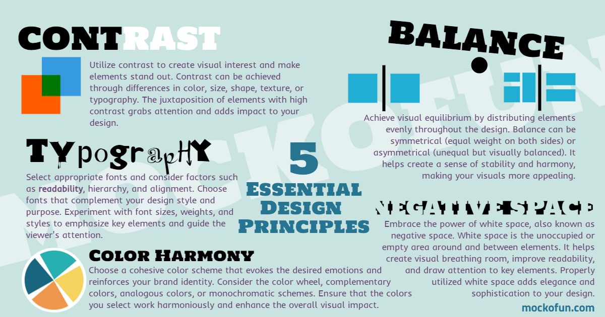
A big thanks to our friends at MockoFun for making this chart to illustrate five essential graphic design principles anyone can apply.
With their user-friendly design tool, you can easily implement the essential design principles we've discussed in this article. From experimenting with contrast and balance to selecting captivating typography and harmonious color schemes, MockoFun provides a platform that helps you bring your design ideas to life.
Principle 1: Contrast - Making Things Pop!
Contrast is like adding a splash of excitement to your designs. It's all about creating visual interest by cleverly using differences in color, size, or shape. Think of it as adding a pinch of spice to your favorite recipe—it takes the flavor to a whole new level! By incorporating contrast, you can make specific elements in your design pop and grab attention like a firework bursting in the night sky.
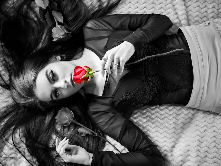
Here's a little secret: Contrast is not just about colors. It can also be about the interplay between light and dark, big and small, or even rough and smooth. It's like a dance between opposites, where each element shines brighter because of the other. Imagine a black-and-white photograph with a single red rose—it's that eye-catching contrast that makes the rose the star of the show.
Principle 2: Balance - Finding Harmony in Design
Have you ever tried to balance a seesaw? When both sides have the same weight, the seesaw stays level. That's the idea behind balance in design. It's about distributing elements evenly to create a sense of stability and harmony. Just like arranging items on a seesaw, you can create balance in your designs through symmetry or asymmetry. Symmetry is like having identical items on both sides, while asymmetry is like having different items that still balance each other out. Experiment with arranging elements in your design to achieve a visually pleasing composition, just like finding the right balance on a seesaw!
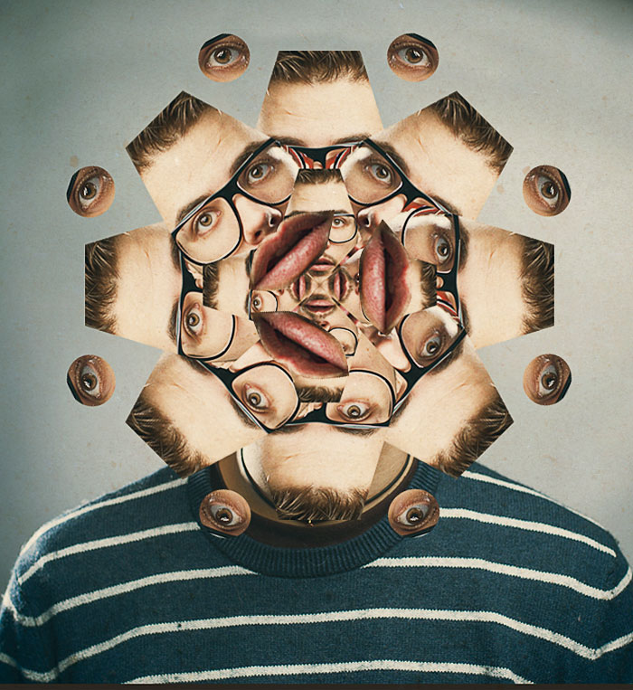
Sometimes the easiest way to add symetry to your design is to use repetition or mirror reflection effect. You can even go further and make your design surreal, like this kaleidoscope effect.
Principle 3: Typography - Giving Words a Voice
Imagine reading a handwritten note from a friend. The style, size, and legibility of their handwriting can give you a sense of their personality and emotions, right? That's what typography is all about - giving words a voice! It involves choosing fonts that reflect the message you want to convey. Fonts can be playful, elegant, bold, or casual. Just like choosing the right tone of voice when speaking, selecting the right font sets the mood for your design. Experiment with different fonts, sizes, and styles to emphasize key elements and create a typographic hierarchy that guides the reader's eye.

Choosing the right fonts for your designs can be difficult. Find inspiration in your font choice by looking at other great designs like fonts from movies.
Principle 4: Color Harmony - Painting with Emotions
Imagine walking into a room painted in vibrant colors, filled with joyful decorations. It instantly uplifts your mood, right? That's the power of color! Color harmony is about selecting colors that work well together to create a specific mood or evoke certain emotions. Just like using different shades and tones of paint to create a harmonious room, you can choose colors that complement each other in your designs. Think about the feelings you want to convey and experiment with color combinations to create a visually pleasing and emotionally impactful design.

Principle 5: White Space - Breathing Room for Clarity
Imagine looking at a crowded room with people standing shoulder to shoulder. It's hard to focus on any one person, right? That's where white space comes in. White space, also known as negative space, is the empty space around and between elements in your design. It provides breathing room, allowing your design to be more visually appealing and easier to understand. Just like leaving space between people in a crowded room, incorporating white space enhances readability and emphasizes important elements. Embrace the elegance and simplicity of white space to create a clean and organized design.
Combine your knowledge of negative space with typography and you can get some really cool designs
In Conclusion
Congratulations!
You've discovered the five fundamental design principles that will take your visuals to new heights. By understanding and applying contrast, balance, typography, color harmony, and white space, you have the power to create stunning and impactful designs. Remember to experiment, trust your instincts, and let your creativity flow. Whether you're designing a poster, creating a social media graphic, or working on a school project, these principles will guide you towards creating visuals that leave a lasting impression on others.
Now it's time to apply what you've learned and unleash your creativity! Use MockoFun as your design companion and explore the possibilities. Remember, great designs are not just about the tools you use but also about understanding the principles that make them shine.
Happy designing!
Kaleidoscope Effect Photoshop
Psychology of Logo Design
No comment(s) for "Design Principles"