Tips to Choosing and Creating the Perfect Color Scheme for Your WordPress Website
To choose the best color scheme for your website's palette of primary, secondary, and neutral colors requires a bit of knowledge about color theory and online tools like WordPress customizer, Photocopa, or Adobe color wheel (Kuler).

Choosing a color scheme for your website is more important than you may realize. Color schemes might play a small role in the overall design but it enhances the user experience.
Colors have a psychological effect on people and different colors reflect different things as well. Large corporations hire experts to choose the perfect color combination for their brands and products. Color is also responsible for almost 80% of brand recognition.
The color schemes are useful in building your brand imagery along with other graphic elements. If you want to sell your work read our article on how to make money as a graphic designer online.
Creating a color scheme can be an overwhelming task for beginners but using the right tools and following the right steps can help you build your WordPress website with ease.
Steps to Choosing the Right Colors
To create a color scheme, you first have to choose the right color combination. The best WordPress themes always create a pattern for their entire website layout. This color pattern becomes its identity.
Here are a few things you should consider when choosing the right color scheme.
1. Select Your Primary Color
The primary color will act as a foundation for your website. Your primary color is going to be the shade that will be used the most throughout your website. Read here more about what are primary colors and secondary colors and other basics of color theory.
If you already have an existing brand then make sure the primary color of your website matches with your existing brand and products. This helps you increase brand recognition and creates consistency in both offline and online platforms.
If you are confused about which color to choose then you can do a little bit of research on color psychology in branding. As already mentioned, different colors have different meanings and effects.

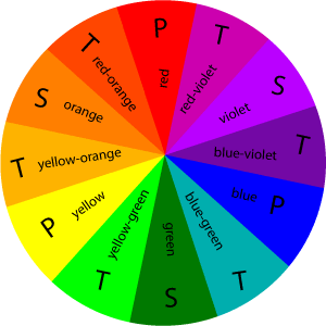
For instance, green reflects harmony, nature, and growth; blue represents tranquility, and trust; black represents authority, power, and security; white is associated with elegance and sophistication; red reflects warmth, youth, excitement, and ambition.
Before choosing your primary color, think about what you want to make your visitors feel about the website. This is very important since your whole brand will develop around it.
2. Choose a Color Scheme For Your Website
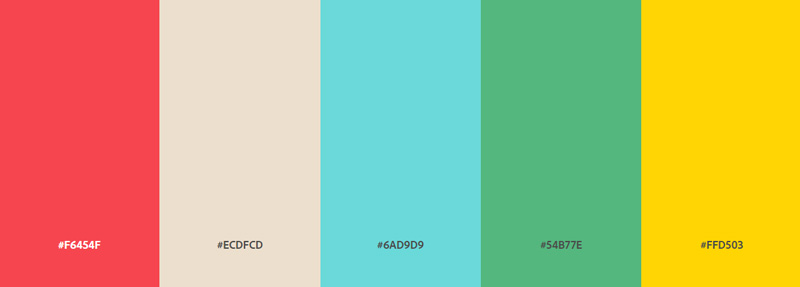
Once you have selected your primary color, you will need a few other shades to complement it. Always use a limited number of colors. For most websites, 3-4 colors should suffice. Any more than that will make your audience a bit confused about what your website is trying to portray.
You can create a fun and professional color scheme by combining warm accent colors, such as vermilion or light yellow, with a high-contrasting color, such as a clean blue background.
You can create a bolder look by matching high contrasting colors with striking neon accent colors or you can create a unique vibe by mixing cooler colors with warm contrasting colors.
3. Design Your Website
After finalizing your secondary colors, the only thing left is to combine them and start designing.
For applying colors, a good rule of thumb would be to follow the 60-30-10 rule. The numbers are considered as percentages. Meaning, 60% of your website should be covered with your primary color, 30% should be covered with the secondary colors, and the rest of the 10% should be covered by neutral colors.
Primary colors should be used on the hotspots of your website. They’re usually vibrant and bold, used to attract and retain your users. For example, you should use primary colors on CTA buttons, benefits icons, download forms, and headlines.
For the less important information, such as subheadings, secondary buttons, active menu items, testimonials, and other secondary items, use your secondary colors.
Neutral colors will help tone down and balance all the colors together. It should be used for texts and particular sections of your websites.
Tools You Can Use to Create Color Schemes
There are plenty of tools to help you create the right color scheme. Here are some of our favorite customization tools.
1. WordPress Color Customizer
There are different plugins you can use with the default WordPress color customizer. Here, we are going to talk about the 2021 default WordPress customizer.
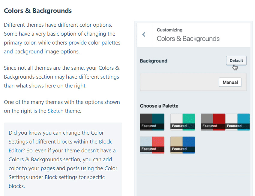
First, you have to go to the customize option in "Appearance". After that, select the color and dark mode tab. Here you can click "Select Color" to choose the background color of the site. This also allows you to add your custom colors. You can select the pallet, click on it or drag it around the palette to make your custom color.
If you already have a color in mind, simply type in its RGB code and you will find it. Next to the palette, you will find a bar where you can select whether you want a lighter or darker shade of that color.
After selecting your preferred shade, click on the dark mode button. This allows your visitors to view the website in dark mode. On the bottom-right corner of your screen, you can click the dark mode button to see how it would appear to the visitors.
Once you are done with all of that, simply hit the publish button.
2. Photocopa
Photocopa is a tool created by Colorlovers and is a great place to get ideas and inspiration about colors. They have built-in tools that can generate amazing color schemes from different kinds of photos. So, create a color scheme from image:
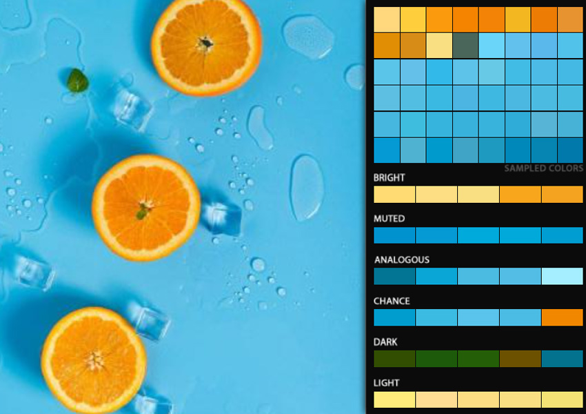
You can also use its basic tool to select a particular color and allow the generator to combine other colors with it and create a scheme for you.
3. Adobe Color Wheel
Adobe Color Wheel is also known as Kuler. It is another amazing tool that can generate color palettes. The most basic default option of the Adobe color wheel is the Analogous which offers you some basic colors to make your scheme. You will have a color wheel to work with and you can select different shades of that color.
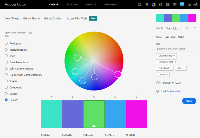
The Analogous option allows you to create color schemes that are simple but elegant. For a more funky look, you can select the complementary color scheme option. This option helps you create sharp contrasting schemes. You can pick a color and the tool will show you the exact opposite color.
Lastly, there is the Triad color scheme option which gives you multiple contrasting colors to work with.
Final Thoughts
Creating the right color scheme might take some time but you should not overlook it. The color scheme of your WordPress website is part of your identity so be thoughtful when deciding what to portray.
Heart Text Symbol
Free PowerPoint Presentation Templates
No comment(s) for "Color Scheme For Website"