Site Plan Drawing
Learn what a site plan drawing is and how to create one. Explore key architectural elements, 2D/3D renders, and expert design tips for compelling layouts.
What is a site plan?
A site plan is a map of a project area, used to explain how everything is arranged. The site plan can range from a simple layout to a highly detailed design, and may be presented as black-and-white line art or as a 2D or 3D render with full color & textures.
- Site plan: A general drawing showing the layout of a property (buildings, parking, landscaping, utilities, boundaries).
- Architectural site plan: A more detailed version focused on architectural elements. It shows how the building sits on the site, design features, materials, entrances, and spatial relationships.
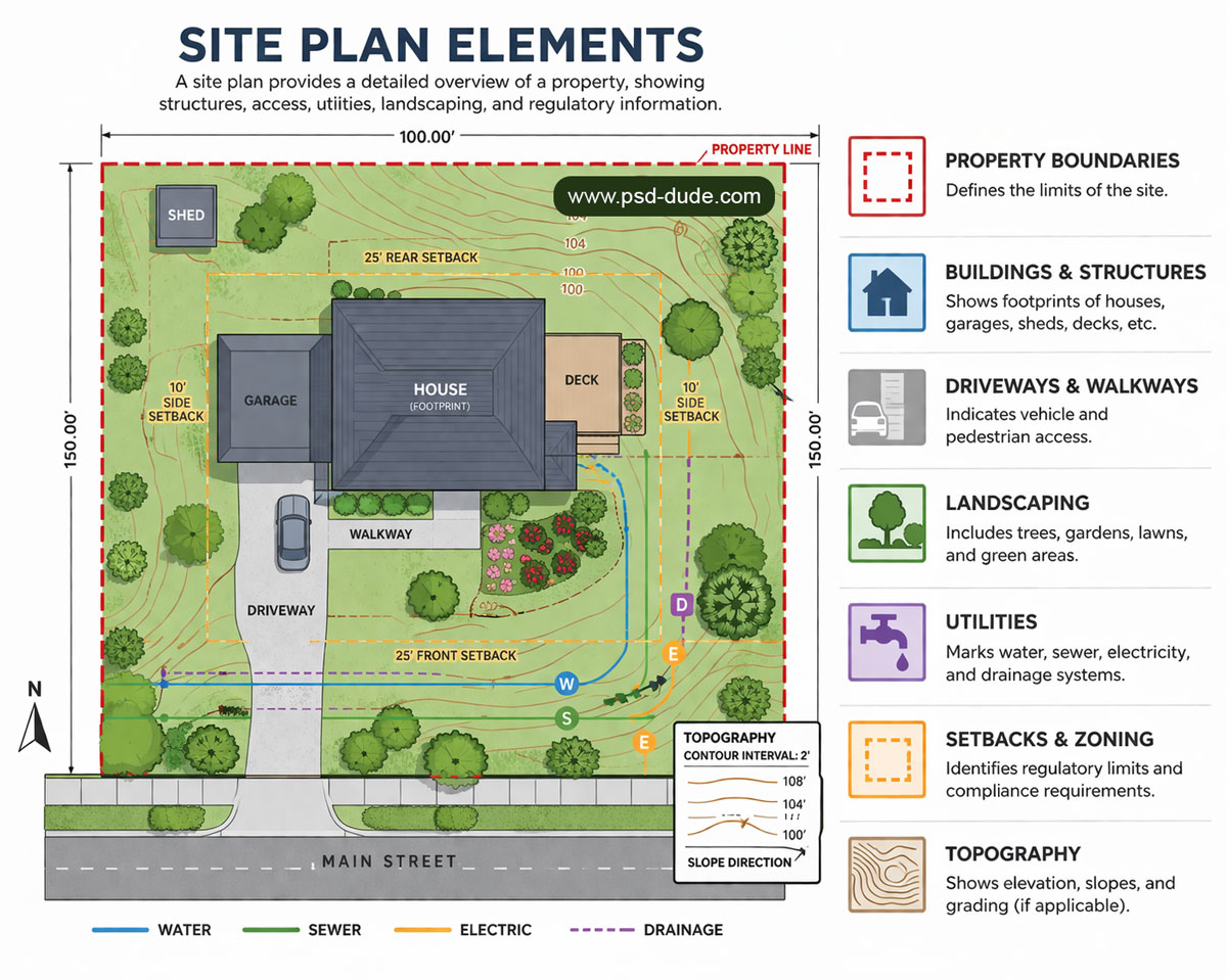
The site plan elements include:
- 📏 Property boundaries – Defines the limits of the site
- 🏠 Buildings & structures – Shows footprints of houses, garages, sheds, decks, etc.
- 🚗 Driveways & walkways – Indicates vehicle and pedestrian access
- 🌳 Landscaping – Includes trees, gardens, lawns, and green areas
- ⚡ Utilities – Marks water, sewer, electricity, and drainage systems
- 📐 Setbacks & zoning – Identifies regulatory limits and compliance requirements
- ⛰️ Topography – Shows elevation, slopes, and grading (if applicable)
Here’s a list of users that need a site plan:
- 🏠 Homeowners – For renovations, extensions, or landscaping projects
- 🏢 Architects & Designers – To plan layouts and visualize designs
- 🏗️ Developers & Builders – For construction planning and approvals
- 🏛️ Local Authorities / Planning Departments – To review permits and zoning compliance
- 🏡 Landscape Architects & Urban Planners – For site layout, green spaces, and infrastructure planning
1. Site Plan Drawing
A line site plan is a simple, top-down (bird’s-eye) drawing of a map (e.g. property) showing:
- Boundaries, plot layout, roads, pathways
- Building footprints (just outlines)
- Major landscape features (trees, water, fences)
It’s usually black-and-white, no textures or colors, focusing on accurate scale and placement rather than visual realism.
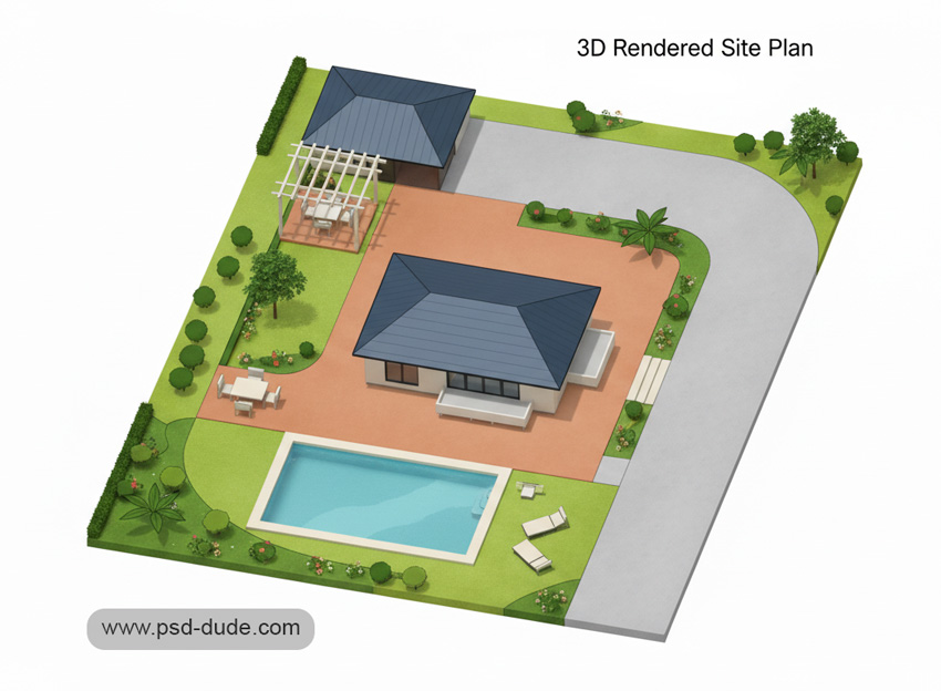
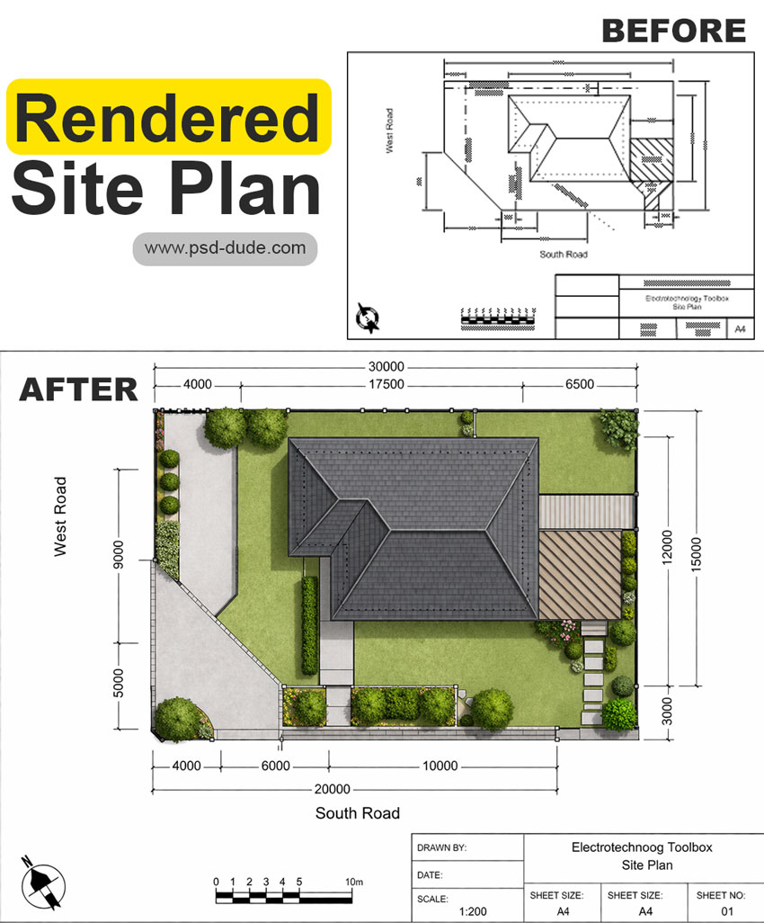
2. Site Plan Render
A site plan rendering is a detailed, scaled illustration showing how different elements are arranged on a site. It typically includes roads, buildings, parking areas, green spaces, and other infrastructure, often with realistic textures and visual depth.
A rendered site plan can be top view, angled 3D view, or perspective view. Often shown at an oblique angle to make it look more realistic and give depth.
- 2D Site Plan Rendering: Essentially lineart (like a regular plan) but enhanced with colors, textures, shading and materials from a top-down or axonometric view to look more lifelike.
- 3D Site Plan Rendering: Full three-dimensional view with depth, perspective, realistic lighting, and textures.
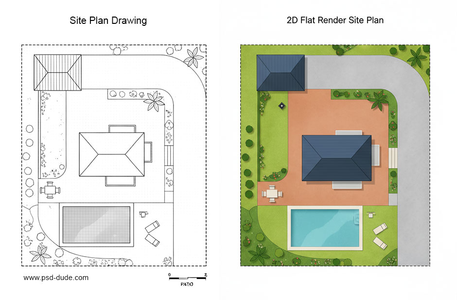
✅ Quick rule: Line site plans = exact top view, Rendered site plans = flexible view depending on what looks best.
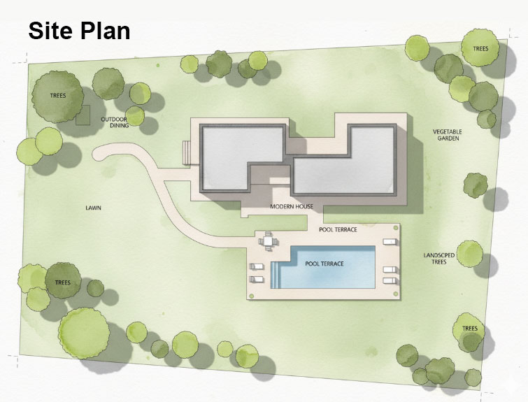
Architectural Site Plan
The architectural site plan is a critical document for planning, zoning compliance, and site analysis, bridging the gap between land use, site design, and construction. It is usually a top-down, scaled 2D drawing representing a property's existing and proposed features, including building footprints, landscaping, site access, and utility infrastructure.
Site Plan Example
How to Make Site Plans Clear & Compelling
Site plans often fail not because of design, but because they’re hard to read for non-experts. Clear graphics fix that.
Making a site plan easy to read involves prioritizing clarity through organized layers, a clear legend, standard symbols, and a balanced, high-contrast visual hierarchy.
In creating a site plan sketch, key techniques include using color-coded, labeled elements (e.g., green for landscaping, grey for paving), incorporating consistent North arrows/scales, and adding subtle shadows to enhance 3D depth.
Key Goal
A good site plan should be understood in 30 seconds:
- What is proposed
- Where it sits
- How it’s organized
👉 Focus on clarity, not decoration.
1. Build a Strong Visual Hierarchy (Top Priority)
Guide the viewer’s eye in a clear order:
- Primary (focus): proposed buildings / development → bold line weight, solid fill, high contrast
- Secondary (support): landscape, paths, public space → softer colors, medium contrast
- Tertiary (background): site limits, existing context → thin lines, muted tones, low opacity
2. Use Color to Communicate Instantly
Color helps people “read” the plan without thinking:
- Green → landscape
- Warm tones (beige/orange) → built areas
- Grey → roads and access
- Blue → water
Best practices:
- Limit to 3–5 colors
- Use shades (light/dark) to show importance
- Keep colors calm and natural
- Avoid red/neon (they signal warning or errors)
3. Make Labels Clear and Organized
Messy labeling = unreadable plan.
- Use a clear text hierarchy:
- Large → project name / title
- Medium → zones, key elements
- Small → dimensions, notes
- Keep labels aligned and consistent
- Use 1 clean font (2 max, sans-serif works best)
- Avoid crossing leader lines
- For dense plans → use numbers + legend
👉 Labels should support the drawing, not compete with it.
4. Add Depth and Texture (Subtle, Not Decorative)
Small graphic cues improve understanding:
- Shadows (very light):
- Consistent direction (e.g., top-left light source)
- Short and soft → avoid heavy/cartoon look
- Textures:
- Light grain for planting
- Subtle pattern for paving
- Keep buildings clean (no texture)
- Trees:
- Consistent symbols
- Vary sizes (real canopy)
- Place naturally, not in perfect grids
5. Keep It Simple
Common mistakes:
- Too many colors
- Too many line weights
- Too many labels
- Everything equally bold
A good site plan is not just accurate—it’s guided communication. It should show what matters first, then add detail step by step.
👉 If everything stands out, nothing does.
Why Rendered Site Plans Are More Effective
1. Easier to Understand
A rendered site plan is easier to understand at a glance:
- Looks like a real place, not just a diagram
- Shows materials (paving, landscape, buildings) clearly
- Uses shadows and textures to add depth
👉 Same data as a technical plan — just easier to read.
2. Improve Legibility
- Line plans → require interpretation
- Rendered plans → can be understood instantly
Helps:
- Clients
- Stakeholders
- Planning authorities
👉 People don’t need to “decode” the drawing—they just see it.
3. Realistic 3D Look
Plot plans can’t show height or context well.
Use aerial views when you need to show:
- Building height and massing
- Relationship to surroundings
- Street impact and connections
👉 Use both:
- Site Plan → layout & land use
- Aerial Site Plan → real-world context
Here is a list with the best file formats for printing that you can use if you want to print your plot plan.
AI Tools for Site Plans
You can easily turn a sketch into a site plan render. In the preview I used a site layout plan and turn it into a rendered site plan (source). AI tools can:
- Generate a layout drawing based on your inputs (size, buildings, roads, green space)
- Adjust it to your needs (style, scale, features)
- Make it look more realistic or presentation-ready
But you usually need to describe what you want clearly (dimensions, purpose, elements), and sometimes refine the result manually for accuracy.
In Conclusion
Weather you are choosing a site plan drawing, a render site plan, an aerial site plan or any other type of plot plan, you must avoid making these common mistakes:
- Too much information → separate technical vs presentation drawings
- Weak contrast (existing vs proposed) → fade existing, highlight new
- Inconsistent labels → keep size, font, alignment uniform
- Unnecessary decoration → keep graphics simple and functional
- Wrong or unclear legend → must match the drawing exactly
Credit: Images made with MockoFun
80s font
Promotional Materials Examples
No comment(s) for "Site Plan"