80s Fonts: Free Movie Fonts, Game Fonts & More
This is the most complete list of 80s fonts. I analyzed 1980s music album covers, movie posters, video games and tried to identify the fonts used. For each of the 80s font I tried to find the original or the closest match and provided a download link and an example of what you can do with these fonts.
Before we begin looking into 80s fonts and other retro aesthetic design, I am sure you will appreciate some 80s text effects addons for Photoshop.
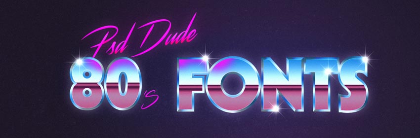
Download this 1980s font text effect PSD file.
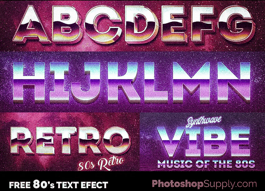
Also, you can take a look at these awesome free to download 80s font text styles.
The 1980s is a fascinating period especially when it comes to design. In this extensive article I tried to list 80s fonts and where these fonts were used. I hope you find this article useful.
I put a lot of hours in this post to do proper research about 80s typography, but it was so much fun and it made me love even more the 80s retro design.
Before we start, let me list only a few of the retro fonts of the 80s that you will find in this article:
- ITC Serif Gothic
- ITC Benguiat
- Swiss 721 BT
- Gillies Gothic Mn Light
- SF Fedora Light
- Albertus
- Titillium Web Black
- Dynamo Regular
- Eurostile
- VCR OSD Mono Font
- and many more...
The article is structured in several sections:
- 80s Movies Fonts
- 80s Video Game Fonts
- 80s Book Cover Fonts
- 80s Music Album Covers Fonts
- Other 80s Font Usage
- OutRun, Synthwave, Retrowave And Futuresynth & Modern Retro Design
I've also made a short video that summarizes parts of this article: 80s Fonts, Synthwave Art & Design by PSDDude
Let's get started!
80s MOVIES What 80s Fonts Dominated the Movie Posters of those Years?
I'm a bit of a fonts hunter, and in another post I was looking at fonts from movies. Let's take a look at what fonts were used in movie posters in the 1980s. I've made a Photoshop template with 80s text effects that you can download for free. Please note that you will also need to have the fonts installed for the text styles to work. If you don't know how to do it, I've made a nice tutorial on how to install a font in Photoshop.
If you prefer online text effects you can check outh this cool 80s Font that you can use for free. Another awesome font is this 80s Online Text Effect which is also free.
FREE DOWNLOAD: 80s Movie Text Effects (2MB)
Top Gun (1986)
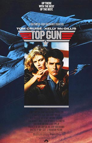
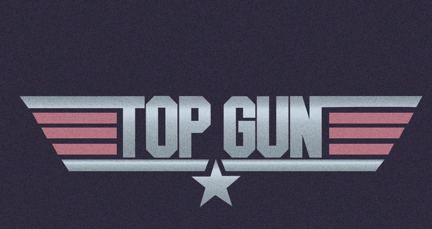
- Download 80s Font: Top Gun Font (FREE) or ITC Machine (Paid)
- Download Top Gun Text Effect
Back to the Future (1985)
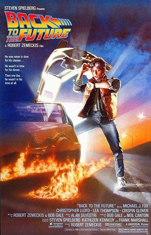
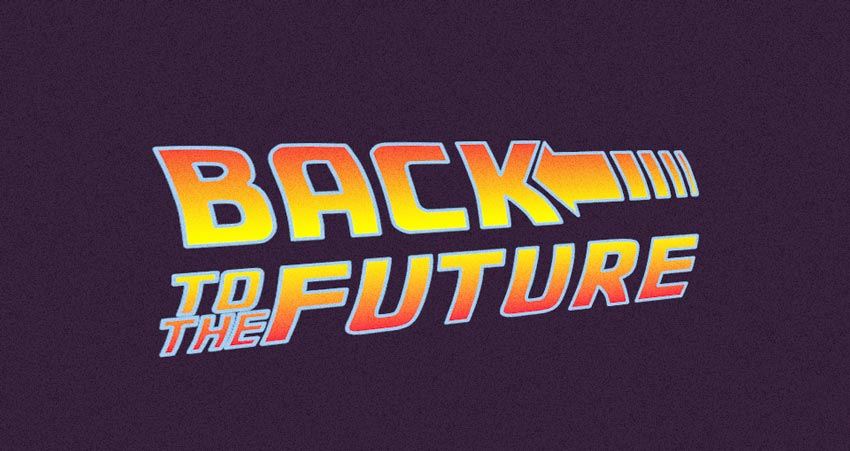
- Download 80s Font: Back to the Future Font (FREE)
- Download Back to the Future Text Effect
Blade Runner (1982)
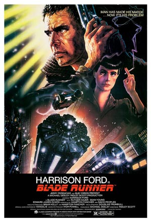
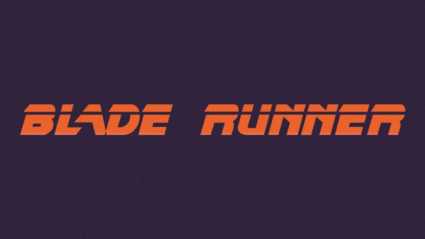
- Download 80s Font: Blade Runner Movie Font (FREE)
- Download Blade Runner Text Effect
Transformers (1982)
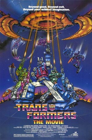
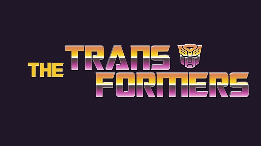
- Download 80s Font: Transformers Movie Font (FREE)
- Download Transformers Text Effect
TRON (1982)
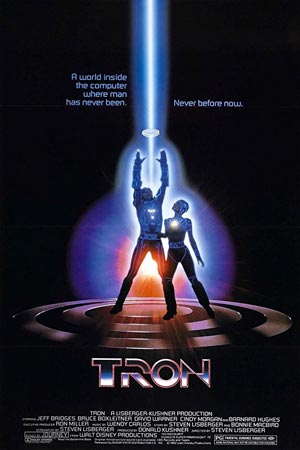
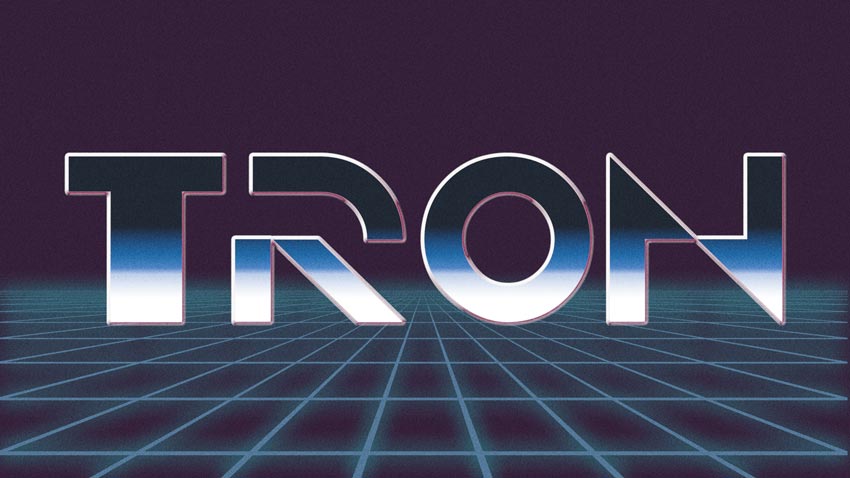
- Download 80s Font: TRON Original Font (FREE)
- Download TRON Text Effect
Star Wars V: Empire Strikes Back (1980)
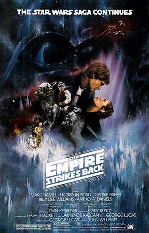
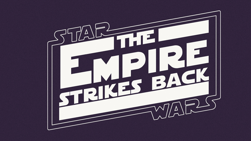
- Download 80s Font: StarJedi Special Edition Font (FREE)
- Download Star Wars V: Empire Strikes Back Text Effect
Star Trek IV: The Voyage Home (1986)
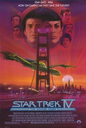
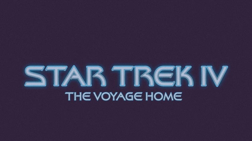
- Download 80s Font: Final Frontier Font (FREE) or Galaxy and ITC Serif Gothic (Paid)
- Download Star Trek IV Text Effect
Aliens (1986)
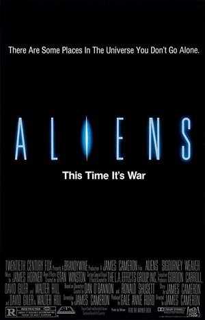
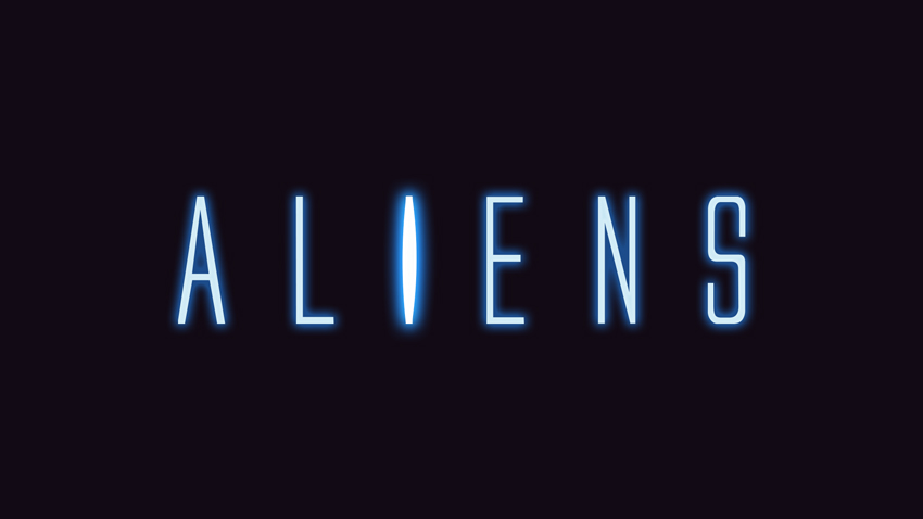
- Download 80s Font: Aliens 1986 Font (FREE)
- Download Aliens Text Effect
The Fly (1986)
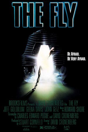
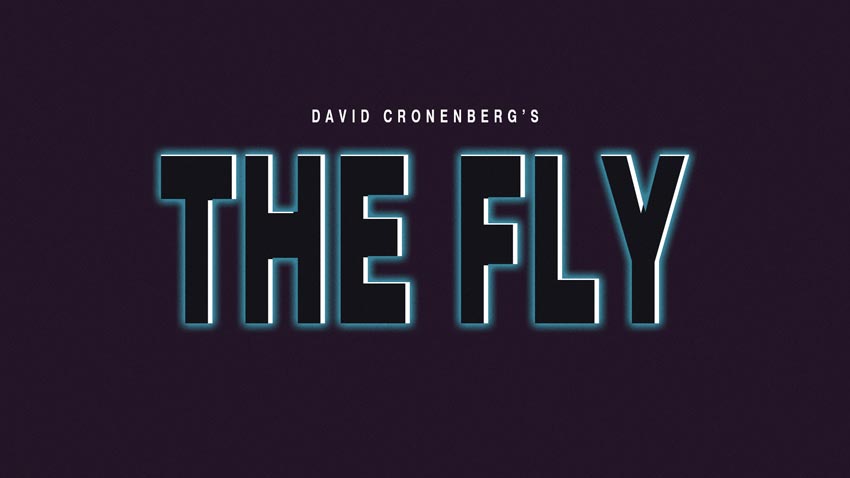
- Download 80s Font: Swiss 721 BT (FREE) and Swiss 911 (Paid)
- Download The Fly 1986 Text Effect
Cocktail (1988)
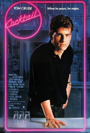
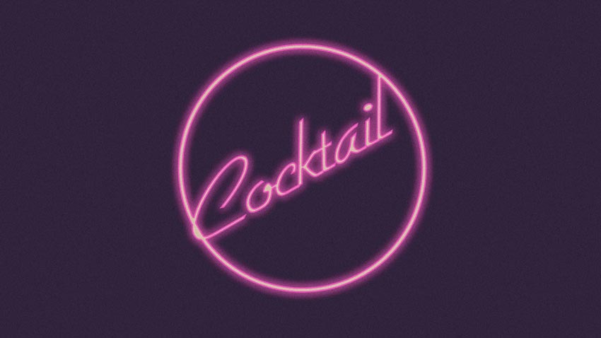
- Download 80s Font: Gillies Gothic Mn Light (FREE)
- Download Cocktail 1988 Text Effect
Indiana Jones and the Raiders of the Lost Ark(1981)
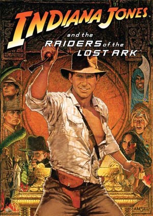
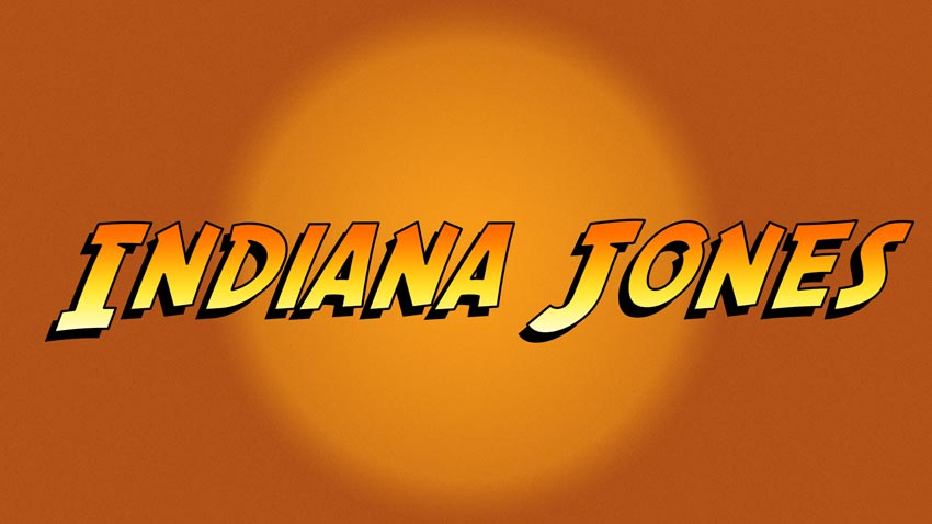
- Download 80s Font: SF Fedora Font (FREE)
- Download Indiana Jones 1981 Text Effect
Argo Fake Movie (1980)
You probably never saw this movie, because it was never made. In 1980 the CIA used the fake movie Argo as a cover story for a rescue mission of six Americans trapped in Teheran during the hostage crisis in Iran in 1979. Posing as Hollywood producers from Studio 6 they went to Iran claiming to scout locations for shooting the movie. To make everything believable they made pretty much everything that was expected of a movie including a script, a poster and even detailed artwork.
The fonts used on the fake poster closely resemble either Protoculture or Robotech GP. The same typefaces re-appear on the poster of the 2012 movie Argo - the story behind the fake movie Argo.
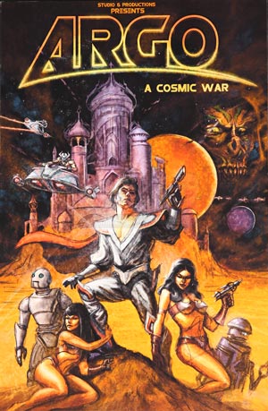
- Download 80s Font for fake movie Argo: Protoculture (FREE) or Robotech GP (FREE)
- Download Argo 1980 Text Effect
Miami Vice (1984-1990)
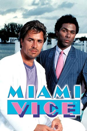
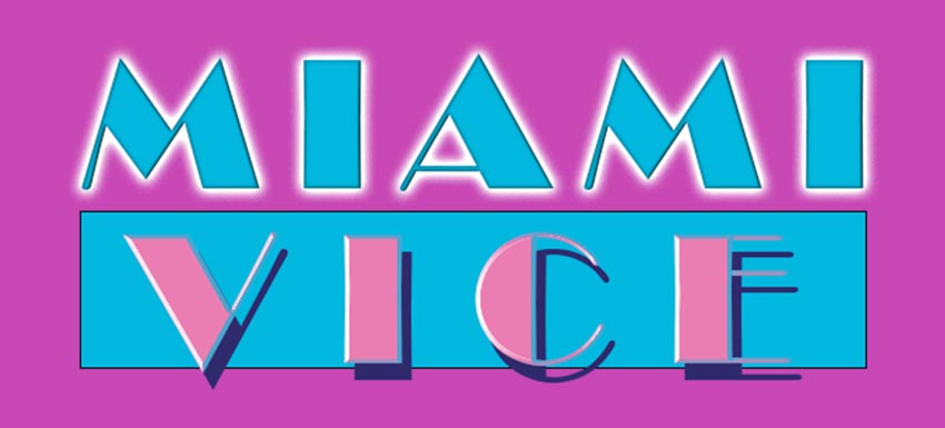
- Download 80s Font for Miami Vice title: Broadway Regular (FREE)
John Carpenter Movies and Music - Carpenteresque
John Howard Carpenter is an American filmmaker, screenwriter and composer. Although Carpenter has worked with various movie genres, he is associated most commonly with horror, action, and science fiction films of the 1970s and 1980s.
Carpenter had a preference for Kurt Russel and the Albertus font casting the former in a lot of his movies and making the latter one of his trademarks.
You can download the free version of the Albertus font from WFonts and the commercial Albertus font from MyFonts.
His films and soundtracks made and performed for his films were such a big influence on 80s culture that I decided to dedicate a separate section in this post.
Here are some "carpenteresque" movies and some info about 80s fonts used in their titles or credits.
Big Trouble In Little China (1986)
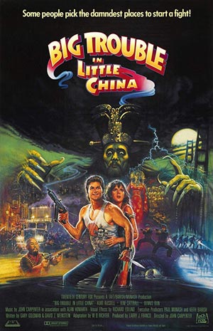
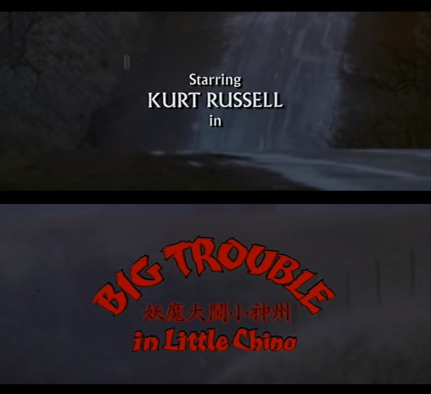
- Credits font: Albertus
- Opening title font: custom made by Dan Curry
- Poster title fonts: similar to Titillium Web Black (FREE) or Frutiger Next ltblack (FREE) (please contact me if you know what it actually is)
Escape from New York (1980)
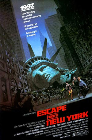
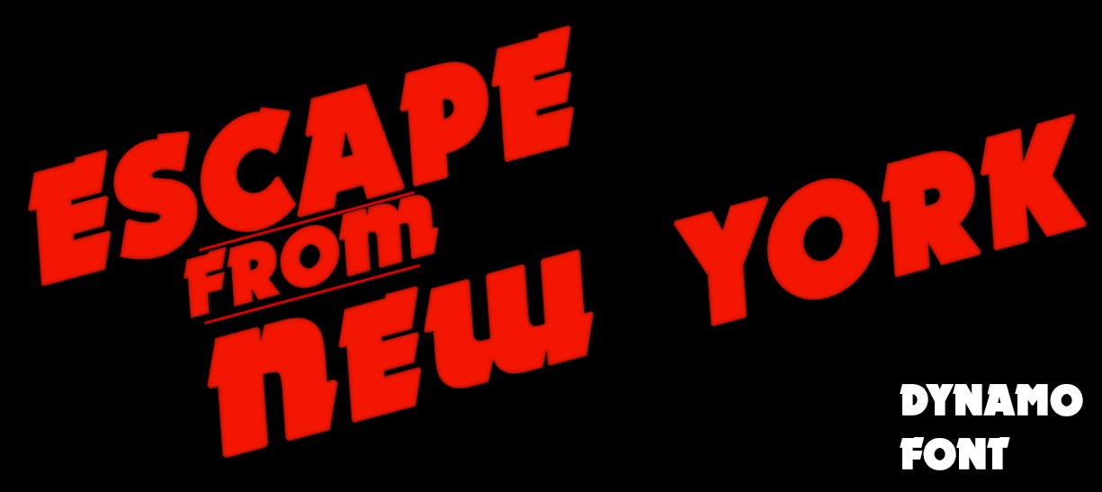
- Poster title fonts: similar to Dynamo Regular (FREE)
Eurostile: Sci-Fi Favorite 80s Font in the Movies
Since we are talking about 80s fonts, I can't leave out Eurostile and it's variant Eurostile Bold Extended. This font was very widely used in movies (especially sci-fi) throughout the 70s and the 80s and it's still used in sci-fi movies today. Here's just 4 examples of Eurostile usage:
- The Fly - used on all computer displays
- Back to the Future - on the dashboard of the DMC DeLorean
- 2001: A Space Odyssey (I know this is 1968, but this movie kind of set the standard for what sci-fi is) - on displays and instructions boards
- Star Trek IV: The Voyage Home - on all Star Fleet computer displays
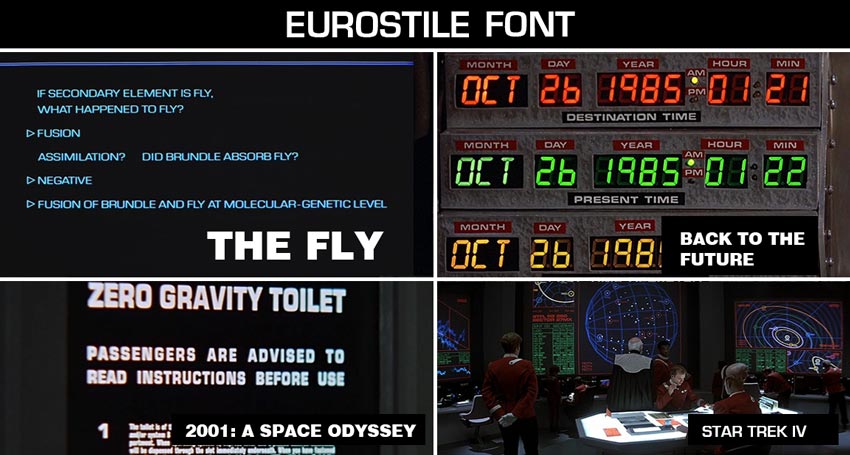
- Download 80s font: Eurostile Font (FREE)
Eurostile is still used in recent movies like District 9, Captain America: The Winter Soldier, Elysium, Iron Man 3 and many more. It's often associated with what monitors and displays of the future will use. If you want to know more about Eurostile usage, check out this long article by Dave Addey.
Did you know that there are quite strict rules for designing a movie poster?
The actor that gets the most money has the most proeminent placing in the poster layout. It's a union thing. There have been actually legal conflicts that were caused by graphic designers that wanted to get a bit creative with that.
If you are an independent film producer and want to createa a professional movie poster, you can get a very affordable online movie poster credits template that's editable online in MockoFun. You can change the text and fonts and then download it as a PNG overlay movie credits poster with transparent background.
80s VIDEO GAMES List of 1980s Fonts in Video Games
Video games were also a characteristic of the 80s. Game designers produced some really amazing designs and their influence is still felt a lot nowadays, especially in modern retro design.
I've collected a few emblematic 80s video game flyer designs and tried to identify what 80s fonts were used. For some of the designs you can check out some of my Photoshop tutorials and add-ons that can be used to re-create similar 80s text effects.
Out Run (1986)
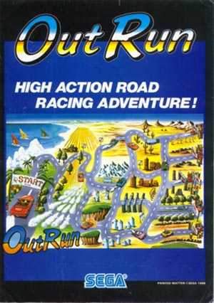
- Download 80s Font for Out Run video game: Highlight Std Regular (FREE)
- Download Out Run Text Effect from PhotoshopSupply
Battlezone (1980)
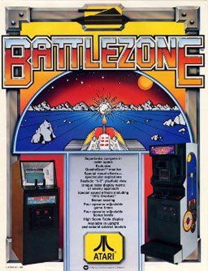
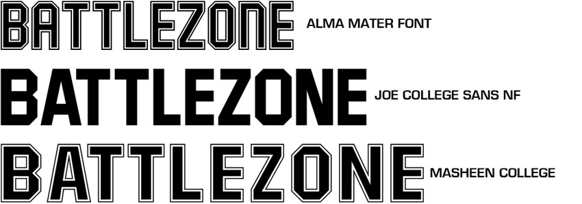
I couldn't find an exact match for this font, but here are some alternatives (if you know what font this is please contact me)
- Download 80s Font for Battlezone video game alternative 1: Alma Mater (FREE)
- Download 80s Font for Battlezone video game alternative 2: Joe College Sans NF (FREE)
- Download 80s Font for Battlezone video game alternative 3: Masheen College (FREE)
Super Mario (1986)
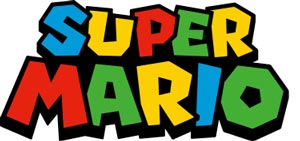
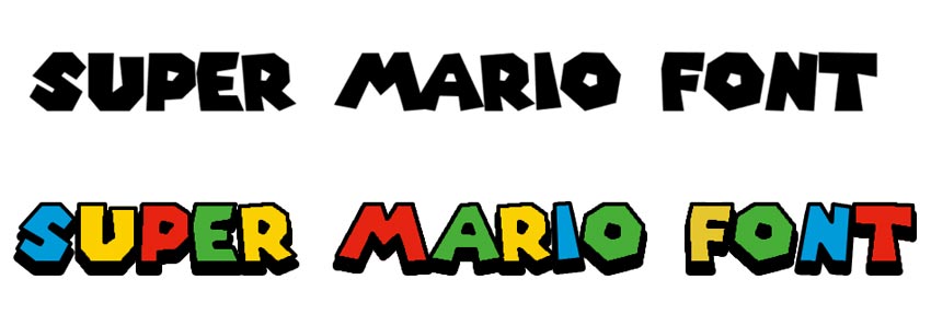
- Download 80s Font for Super Mario video game: Super Mario 256 (FREE)
- Check out my Super Mario 3D Text Effect
Tetris (1984)
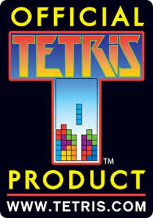
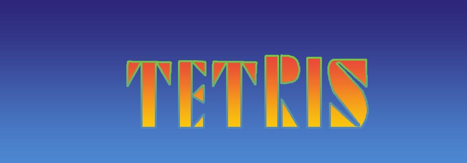
- Download 80s Font for Tetris video game: Tetris (FREE)
Prince of Persia (1989)
Prince of Persia was a wonderful game both aesthetically and technically.
I've contacted the creator of Prince of Persia, Jordan Mechner, through his website. He was kind enough to exchange a few information about this game. As it turns out, the title typography for the game is hand drawn by Paul Dushkin, the in-house designer at Broderbund Software. I tried to find out a match for the fonts and Libra seems to be the closest fit.
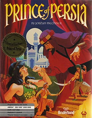
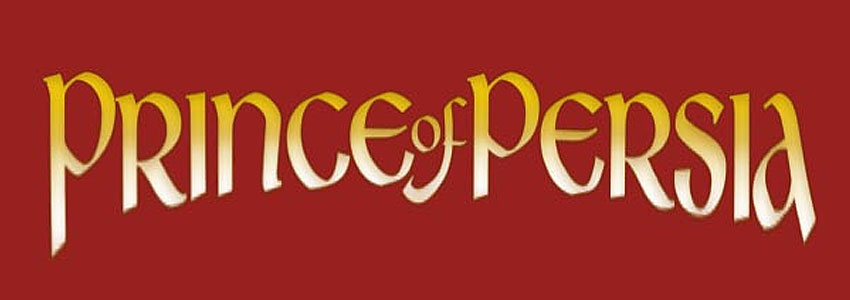
- Download 80s Font for Prince of Persia video game: Libra (FREE) - the closest match I could find
- The Prince of Persia text effect was made using a very basic gold gradient layer style. You can learn everything about creating gold text effects from my list of gold effect Photoshop styles.
When I was around 10-12 years old I spent many hours playing this awesome game. I have to admit, the game was pirated as in those years, just coming out of communism buying games was impossible.
Video games had a great influence on me and they were one of the reasons that made me want to become a programmer. I am one now and earning a living from it.
So, thank you Jordan Mechner and others like you for creating these wonderful pieces of art and programming.
Pac-Man (1980)
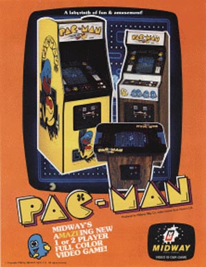
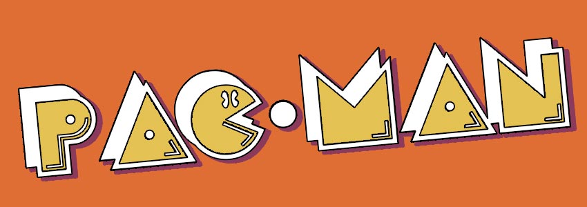
- Download 80s Font for Pac-Man video game: Pac-Man Fonts (FREE)
80s BOOK COVERS What 80s Fonts Were Used for Book Covers?
Stephen King Book Covers
Stephen King is the undisputed master of the horror genre. Probably that's why the fonts used for his name on most of his books is now associated with this genre. I found that the font used on his books is actually ITC Benguiat, an Adobe font created by the American typographer and lettering artist Ed Benguiat.
He crafted over 600 typefaces used in many typography creations including Esquire, The New York Times, Playboy, McCall’s, Reader’s Digest, Photography, Look, Sports Illustrated, The Star-Ledger, The San Diego Tribune, AT&T, A&E, Coke, Estée Lauder, Ford, and others.
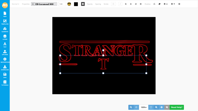
If you are a fan of the TV series Stranger Things, then the ITC Benguiat and it's very close alternative I propose (Eighties Horror) will probably look familiar to you. The title for that TV series uses this very typeface.
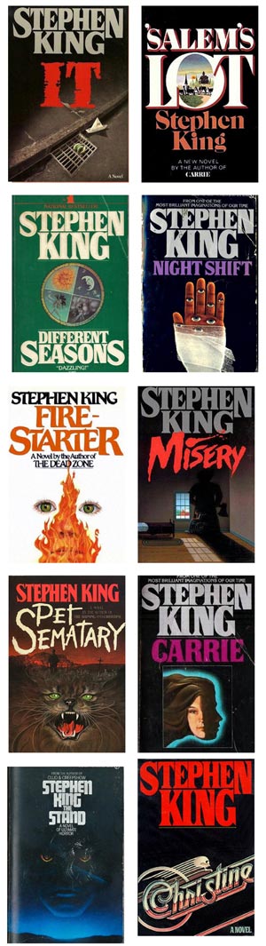
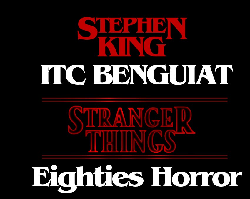
- Download 80s Font for Stephen King's book covers: ITC Benguiat (FREE) or Eighties Horror Font (FREE)
Check out this awesome online Stranger Things Text Generator in MockoFun
Ender's Game Book Cover (1985)
One of my personal favorite book, Ender's Game is a sci-fi masterpiece. Orson Scott Card's book was published in 1985 and had a beautiful book cover design made by John Harris. I contacted John Harris via his agent who was kind enough to answer my emails. I found out that the title on the book cover of Ender's Game was actually not John Harris's choice, but the publisher's. This is often the case with most books.
Though, I don't know for sure, if I had to guess, the font used for the title of Ender's Game is also ITC Benguiat and with a warp applied to it.
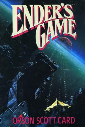
- Download 80s Font for Ender's Game book cover: ITC Benguiat (FREE)
80s MUSIC ALBUMS Fonts of the Most Iconic 80s Album Covers
We looked at 80s fonts in movies, video games and books. But, perhaps one of the most defining characteristic of the 80s was music. I've looked at several music albums to try and gather what fonts did the 80s album covers use. I have a bit of a thing for vinyl records and I am quite proud about my collection. I even used the best online curved text generator to create stickers for my vinyl drawers writing the genre and time frame.
Led Zeppelin Coda Album Cover 1982
Two years after Led Zeppelin officially disbanded after the death of their drummer John Bonham, the album Coda was released in 1982. The album cover was designed by the English art design group called Hipgnosis, a group specialized in cover art design for other bands as well (Pink Floyd, Black Sabbath, AC/DC, Scorpions, etc).
The Coda album cover contained a typeface font called "Neon" which was designed by Bernard Allum in 1978. The font's main characteristic is the fact that all letters are made using a single continuous line making it perfect for neon signs. Unfortunately, I couldn't find a free version of the font, but there's paid version called Ampacity that resembles the font quite well.
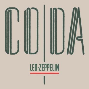
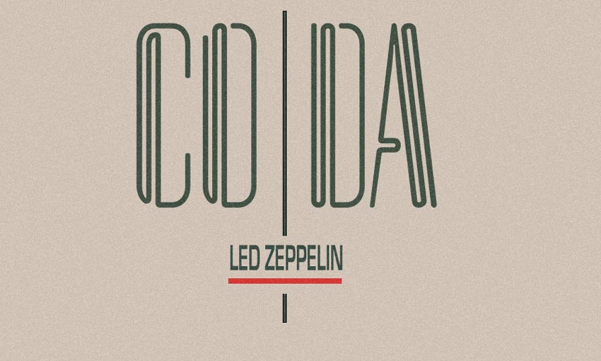
- Download 80s Neon Font for Led Zeppelin Coda album cover: Ampacity (Paid)
Pink Floyd The Wall 1979
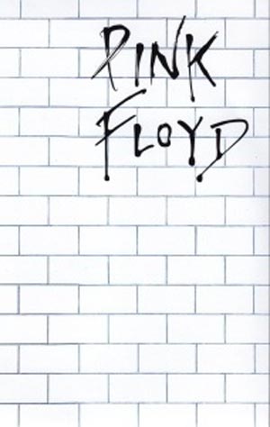
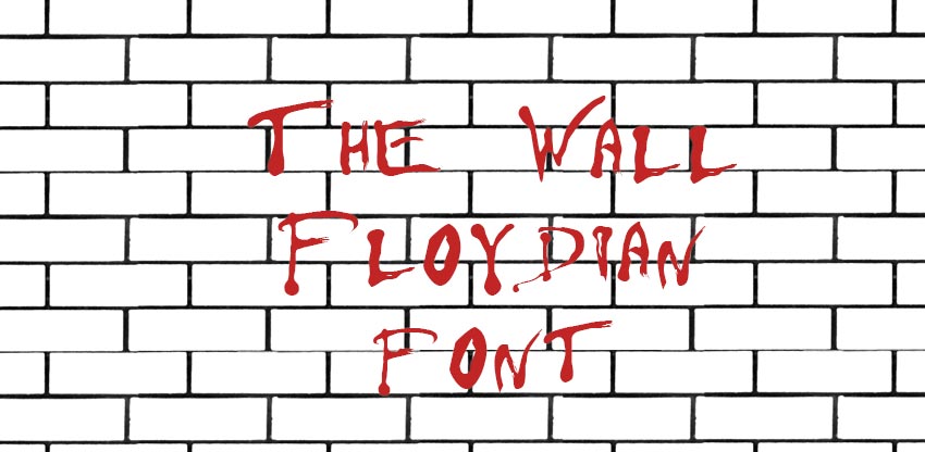
- Download 80s Font for Pink Floyd The Wall album cover: Floydian (FREE)
Prince - Little Red Corvette 1983
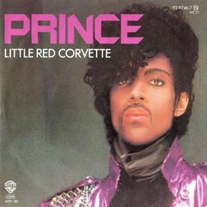
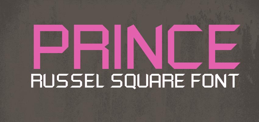
- Download 80s Font for Prince Little Red Covette album cover: Russel Square (FREE)
Iron Maiden 1980 Album Cover
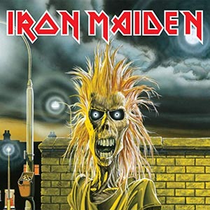
- Download 80s Font for Iron Maiden 1980 album cover: Iron Maiden Font (FREE)
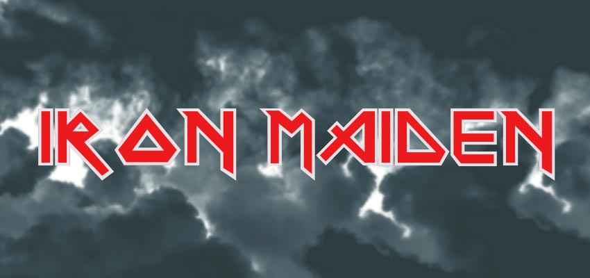
Jean-Michel Jarre ZOOLOOK Album Cover 1984
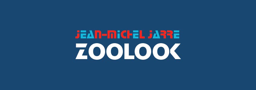
- Download 80s Font for ZOOLOOK 1980 album cover: Stop Font (FREE)
More Retro Fonts of the 80s Other Awesome 1980s Typography and Typefaces
DMC DeLorean Logo Font - Rustproof Body
Made famous by the movie Back to the Future, the DeLorean DMC-12 made for the American market between 1981 and 1983 had a very distinct logo. Using the Rustproof Body font, here's my renditinon of the DMC DeLorean logo and grid.
![]()
- Download 80s Font for DMC DeLorean Logo: Rustproof Body Font (FREE)
- Download the PSD mockup for the DMC DeLorean Logo
VCR OSD Mono Font
Growing up in the 80s for me was mostly about watching movies on my family video VCR. The VCR OSD Mono font was the VHS VCR font that was used on most models. I believe it's still used on handy cams and even on digital cameras. It has a distinct look which I tried to capture in my VHS overlay mockup for Photohshop that you can download for free:
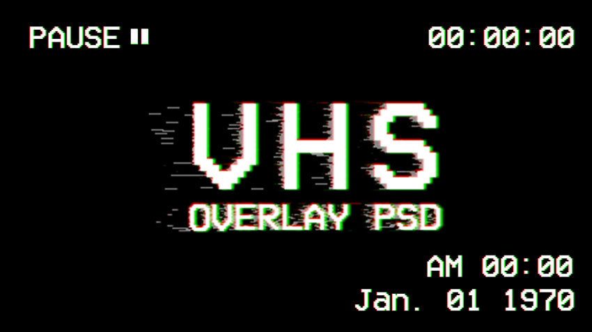
- Download the 80s Font used for VCRs : VCR OSD Mono Font (FREE)
MTV Fonts
1981 meant the launch of MTV or the Music Television channel. This kicked off a huge boost for graphic design and the creation of music videos, something that was rather scarce at the time. I took a look at the logo MTV fonts and here's what I found:
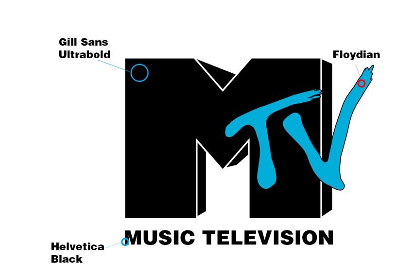
- Download the 80s MTV fonts: Gill Sans Ultra Bold (FREE)
- Download the 80s MTV fonts: Helvetica Black (FREE)
- Download the 80s MTV fonts: Floydian (FREE) (since the TV font is hand drawn, I've used Floydian as a replacement)
MODERN RETRO DESIGN OutRun, synthwave, retrowave, futuresynth & modern retro design
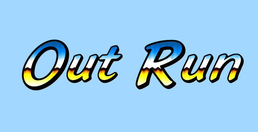
80s retro fonts have become very popular in the last decade or so, especially with the growing audience of synthwave music. A lot of synthwave bands choose retro vintage fonts for their album covers and the design style of these covers has become known as "OutRun" design.
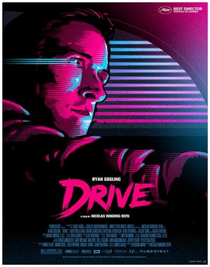
OutRun meaning: A modern retro design trend which takes its name probably from the old arcade game "Out run". The game had a chrome-like logo which is emblematic for the 80s futuristic design style. OutRun was also the name of the debut album of the french artist Kavinsky (Vincent Belorgey). His music is greatly influenced by the 1980s music and is considered representative for synthwave music. Kavinsky's music achieved mainstream recognition after it was chosen for the 2011 film Drive, starring Ryan Gossling.
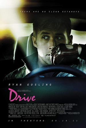
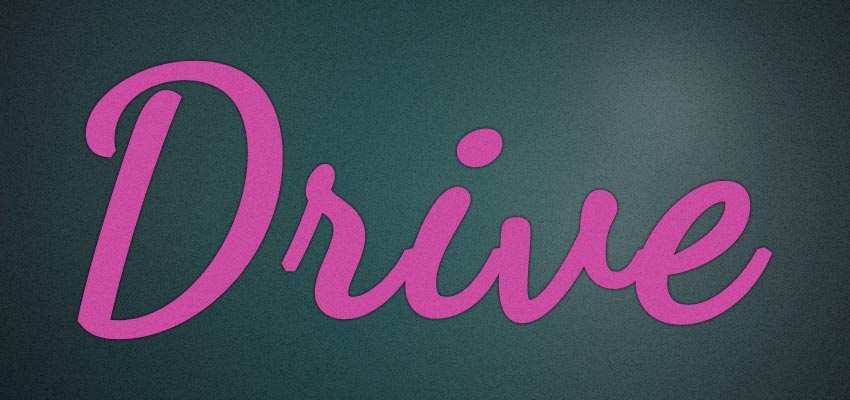
- Download the 80s font for Drive 2011: Dancing Script OT (FREE)
The Drive movie uses a font closely resembling Dancing Script OT font for it's title and credits. A fan created an alternative Drive movie poster in the "OutRun" design style. The poster became super popular and was adopted as an official movie poster.
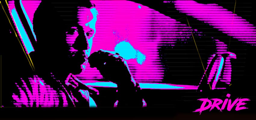
- Download the 80s font for Drive 2011: Road Rage (FREE)
- The poster on the right was made using the free 80s Retro Poster Photoshop action from Photoshop Supply
This design style has been used a lot especially with the comeback of the 80s music styles known as synthwave, retrowave or futuresynth.
Whether you are making a synthwave album cover, a futuristic poster, or a personalized name design for your social media profile, these retro templates provide a great starting point.
OutRun Wallpaper
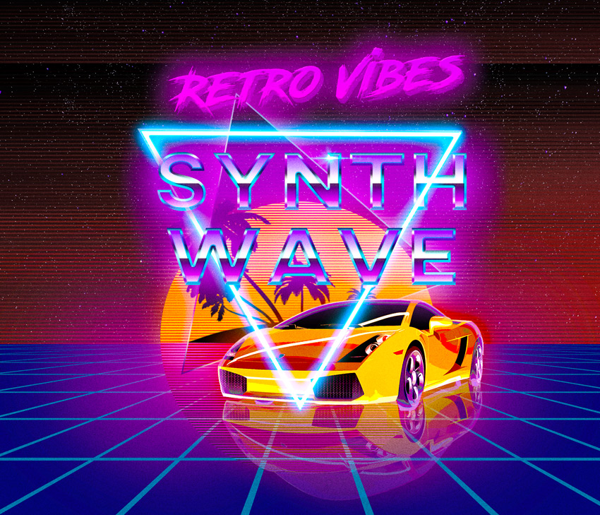
Almost all OutRun designs have a few common elements that try to render the look of the 80s:
- Gradient chrome text
- Perspective grid
- 80s Retro sun with stripes and palm trees silhouettes
- Neon like text
- A neon triangle
- Old race car (sometimes with light trails)
This design looks like an 80s album cover. But, I made it with Photoshop and a free, premade 80s text template from PhotoshopSupply. It only took me only a couple of minutes.
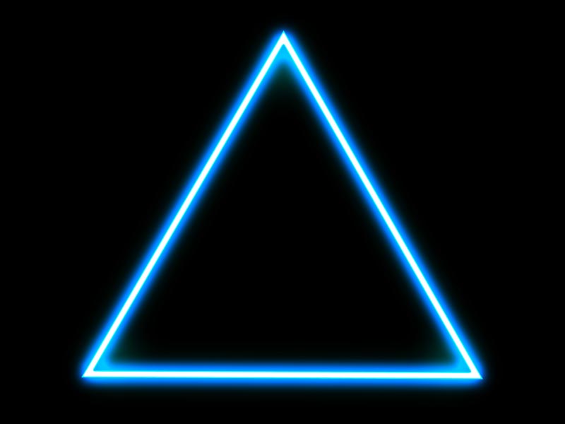
The template also includes a beautiful 80s background from Textures4Photoshop and I've aded this nice neon glowing triangle also from Textures4Photoshop.
I did a lot of digging to figure out where the elements of OutRun design come from originally and here's what I found:
What Inspired the Gradient Chrome Text in OutRun Design?
Starting in the 50s car manufacturers started to exagerate with the use of chrome plating - from chrome logos to chrome fender decorations.
During the following years though to the 60s, 70s and 80s chrome plating began to be widely used as a symbol of the future. Somehow, people in those times thought that in the future everything will be made of chrome.
There was also an obsession with robots, also a symbol of the future. So, it was only natural to have chrome plated robots. Remember the cylon centurions from Battlestar Galactica (1978-1979)?
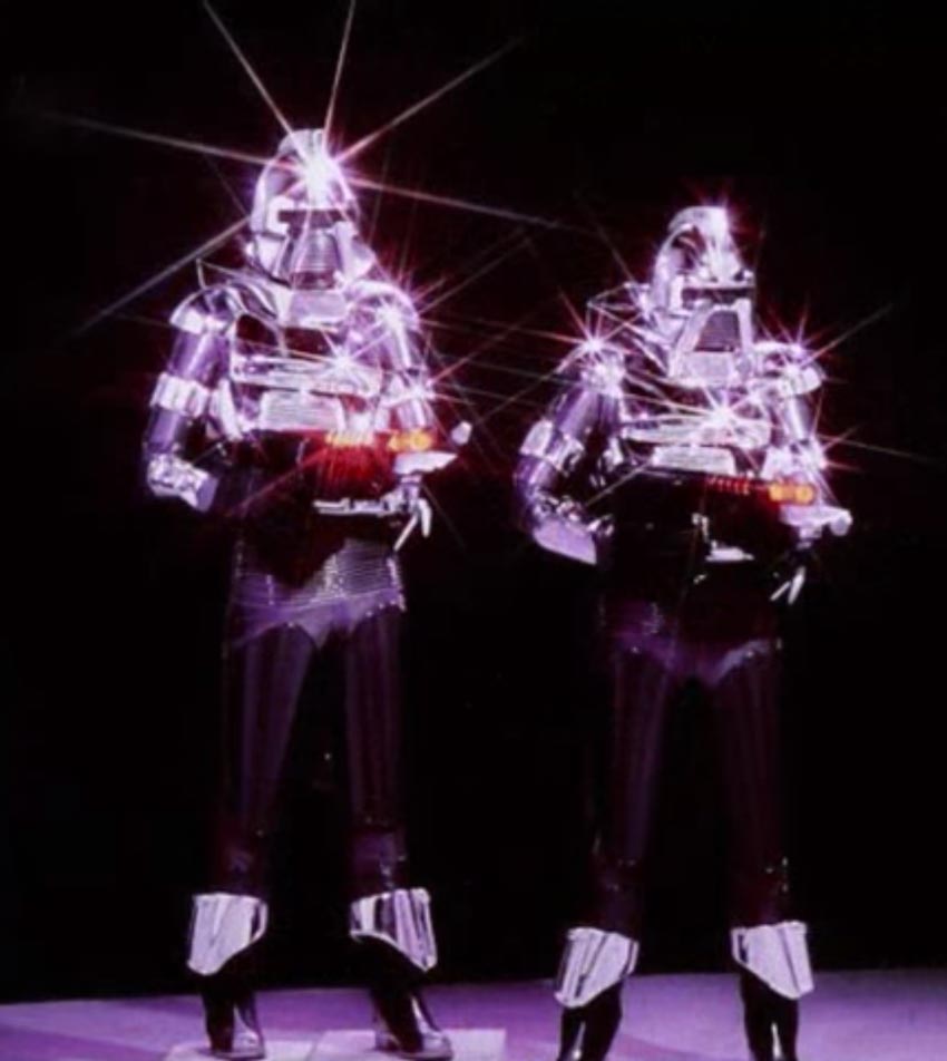
Also, note the exagerated starburst effect. This is something that is often included in outrun design to emphasize the shiny nature of chrome.
Chrome robots and chrome text was very widely used in the 80s. I think one of the most amazing example making use of chrome is the art of Hajime Sorayama. One of his female chrome robots was used in November of 1980 on the cover of the sci-fi magazine Heavy Metal (chrome text with chiseled bevel and starbursts):
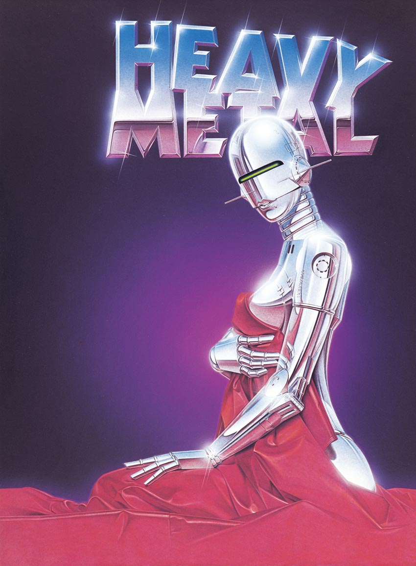
- Download 80s font for Heavy Metal Magazine logo:Kabel Black (FREE)
Back then it took real skill to create the chrome effect in illustrations. This was achieved using the airbrush tool.
Nowadays using Photoshop anybody can create awesome realistic metal chrome text effects. Check out my awesome list of free and premium chrome effect Photoshop styles.
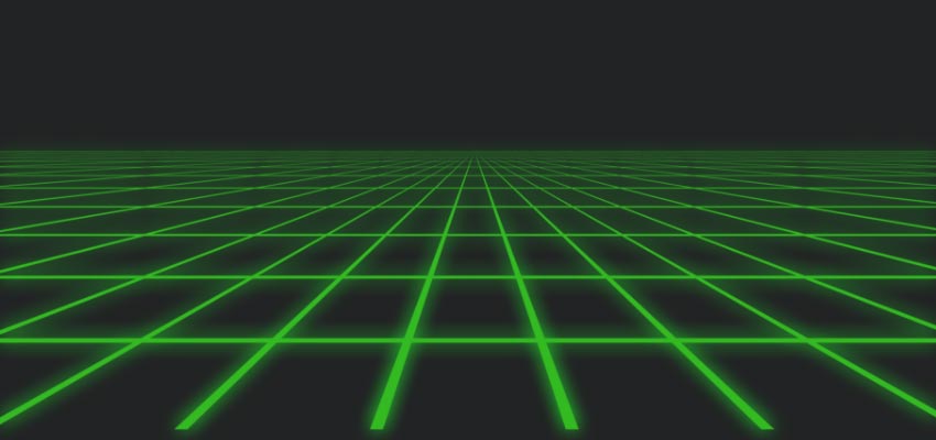
How About the Perspective Grid?
 FREE DOWNLOAD: perspective grid goodies from Photoshop Supply.
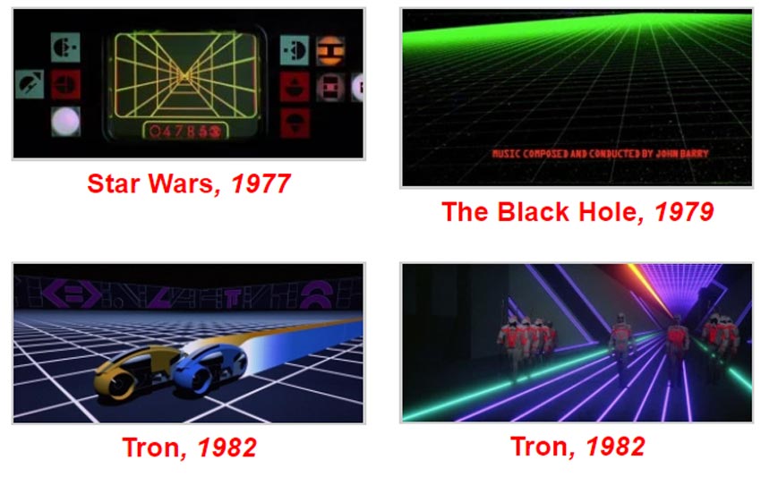
As for the other design elements of OutRun design nothing is really certain. Here are just some probable sources of the perspective light grid:
- The movie TRON makes heavy use of the perspective grid. It's basically the foundation of the VR world depicted in the movie.
- The old vector monitors of arcade games made heavy use of glowing grids.
- The opening credits of the movie Black Hole from 1979 make heavy use of computer generated perspective grids
- Also in the famous Luke vs. Death Star scene in Star Wars, Luke initially uses a computer grid display targeting system, only to put it aside when Obi-Wan Kenobi tells him "Use the force Luke!"
- There's a very good article by Richard McKenna about how the perspective grid defined 1980s futurism, so read more if you are interested
Retro Sun With Palm Trees
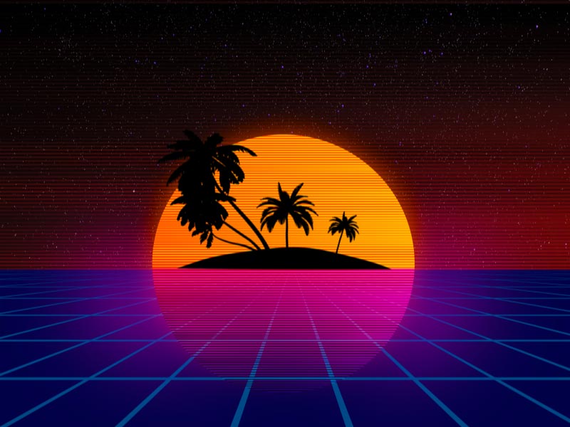
FREE DOWNLOAD: retro sun background from Textures4Photoshop.
In most OutRun designs you will see the setting sun and palm tree silhouettes. The retro sun has a very distinct look, having an orange gradient color and stripes.
I had to do a lot of digging and research. I wanted to find out why was this design element included in OutRun / retrowave design? There is an entire sub Reddit dedicated to synthwave and 80s retrofuturistic aesthetics, so I asked my question there.
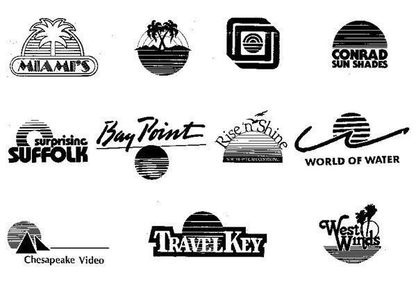
Looks like the retro sun and palm trees silhouettes are related to the surf culture of the west coast. It goes beyond the 80s to the 70s. Someone on the sub-reddit thread gave me the idea to look into registered trademark logos of companies in the 80s, and it's clear that the striped sun and palm trees were widely used symbols back then.
Here's just a few of them:
1980s Company Logos With Retro Sun & Palm Trees
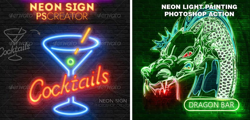
80s Neon Lights
Neon lights are also very present in outrun design. It's probably because of 70s and 80s disco influence. Disco clubs often had neon lights.
Another thing is that synthwave music is often associated with a race car drivig at night. The night city lights together with the stop lights of the car and the foggy atmosphere of synthwave music videos produce a neon like effect.
Creating the neon effect in Photoshop ca be quite tricky, but you can easily create realistic neon effects using one of my Photoshop action from Graphic river:
The Neon Triangle
The triangle is a powerful symbol. It can stand for both female and male energies, for harmonies of time, mind, body and emotion. The letter Delta in the Greek alphabet is written as a triangle, and in ancient greeks it meant the place where multiple rivers meet. So, a confluence of energies.
Guess this is very much in line with the feeling of 80s music and synthwave music.
The Old Race Car
The synthwave movement is associated with forever young and rebel spirits. So, the race car symbol is not really hard to explain. The artist Kavinsky drives a Ferrari Testarossa - a classic retro car - and was inspired by this car for his first album "Testarossa Autodrive". The movie Drive 2011 only came to build up on the symbolism of speed and old sport cars in synthwave.
80s Text Effect Online
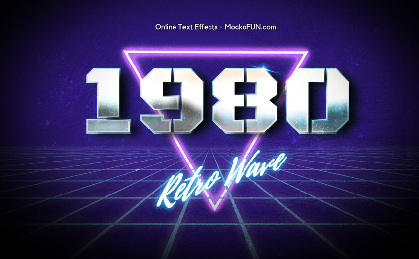
Conclusion80s Retro Futurism and the Use of 80s Fonts
I hope you enjoyed this article about 80s fonts and modern retro design as much as I enjoyed writing it. I'm sure I barely scratched the surface and for sure you can write books about this subject.
So, perhaps I will come back to this subject if I get enough positive feedback from you guys. Please rate this article if you've enjoyed it and please drop me a comment below to let me know if I've missed anything.
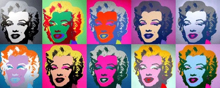
Passionate about retro art? I've been studying various aspects of retro art and I particularly took a closer look at pop art. If that's something that interests you, you should definitely take a look at this list of Pop Art Artists (35+ Famous Pop Art Artists & Their Best Works).
If you are looking for other great colections of typography fonts, I really recommend taking a look at this amazing list of over 25 free cake fonts from MockoFun that you can use in Photoshop or even online.
Microlearning
Site Plan
9 comment(s) for "80s font"
THANK YOU!! reply
The only movies I could watch were from bootlegged VHS cassettes. By the age of 12 I think I had seen over 600 movies :-)
The 80s and early 90s were my childhood years, so this is also why I look back with nostalgia. reply
I am really fascinated by the 80s, I don't just say that. I think you can easily write books about the 80s and for sure I will want to come back to it.
There are so many things that I didn't cover in here. I've recently read a lot about the death of disco and the birth of house music, Memphis group design, synthesizers, etc. There a lot of movies that I didn't cover in this article like The Terminator (1984), Die Hard (1988), The Neverending Story (1984), War Games (1983) that are really important too for the foundation of the 80s culture.
Maybe I will even come back to this article and extend it, so check back soon :-) reply
Glad you enjoyed this! reply
FREE DOWNLOAD: 80s Movie Text Effects (2MB)
There is only one PSD file that contains all the 80s text effects. reply